| Feature | iPad 2 | iPad 3 | iPad 4 |
| CPU: | Dual-Core Apple A5 | Dual-Core Apple A5X | Dual-Core Apple A6X |
| Graphics: | PowerVR SGX543MP2 | PowerVR SGX543MP4 | PowerVR SGX543MP4 |
| Display: | 1024x768 | 2048x1536 | 2048x1536 |
| Memory: | 512 MB | 1 GB | 1 GB |
| Storage: | 16, 32, 64 GB | 16, 32, 64 GB | 16, 32, 64 GB |
| Camera: | Front-facing and 720p rear-facing | 720p Front-facing and iSight 5 MP rear-facing | 720p Front-facing and iSight 5 MP rear-facing |
| Data Rate: | 3G | 4G LTE | 4G LTE |
| Wi-Fi: | 802.11 a/b/g/n | 802.11 a/b/g/n | 802.11 a/b/g/n |
| Bluetooth: | 2.1 + EDR | 4.0 | 4.0 |
| Siri: | NO | YES | YES |
| Accelerometer: | YES | YES | YES |
| Compass: | YES | YES | YES |
| Gyroscope: | YES | YES | YES |
| GPS: | 3G Version Only | 4G Version Only | 4G Version Only |
Saturday, 13 April 2013
The iPad 2 vs iPad 3 vs iPad 4 Comparison Chart:
9 Reasons to Root Your Android Device
To root or not to root? That is the question. Rooting your Android device definitely pushes you up a level or two in your geekdom. It requires a certain level of commitment, at least a little savvy, and even a modicum of risk. So, why would you want to bother?
We've got nine good reasons for ya.
What Is Rooting?
We talk about rooting plenty around here, but here's the high-level look for the few remaining uninitiated. Rooting means gaining root access to your device. When you take your phone out of the box, while there are plenty of settings you can tweak, you can only alter what the manufacturer allows you to. By gaining root access you can modify the device's software on the very deepest level. It takes a bit of hacking (some devices more than others), it voids your warranty, and there's a small chance that you could completely break your phone forever. But you know what? It's still totally worth it for all the goodies you get access to.
1. Apps Aplenty
If you've spent much time in Google Play, you know you're not exactly hard-up for good apps. But why settle for good when you can have great. Once you're rooted not only can you get more apps, but the apps you have access to can get way down deeper into your phone's brains. In some cases you'll be able to do things that carriers, manufacturers, and/or Google may not want you to do. Some will allow you to do things of questionable legality. For example, Network Spoofer uses your device to set up a fake wireless network. When your houseguests sign in, you can make ever image they see inverted, or all of the text fuzzy. It's a harmless prank, but of course it could (but shouldn't!) also be used for stealing passwords and other nefarious things.
Full size

2. The Latest OS Updates
Dammit, why am I always three updates behind. This may be the most common complaint among Android users, less than half of whom have made it as far as Ice Cream Sandwich. Between the Google, the carriers, and the hardware manufacturers, there are a whole lot of shenanigans behind closed doors that determines when (or if) your phone gets an upgrade. Who has the patience?
Android's developer community, on the other hand, is a hardcore bunch. They're often able to get the new OS onto a phone months before the carrier releases the update, often along with a few bonus features. Once you're rooted, you just have to find the OS version you want (optimized for your specific device), and it's generally extremely easy to install the latest and greatest.
3. Ditching the Skin
Android enthusiasts rightly hate the software skins that hardware manufacturers use to brand their devices. They're often bulky, ugly, unwieldy, or just downright not as clean and functional as stock Android. They're also a big reason those OS updates take so long. You're almost always better off without.
 So root! Once you do, you can download and install any number of custom-built ROMs (different versions of the Android firmware). Some of them are highly customized and tweaked to add features, and others are basically just stock Android. Cleaning off an ugly skin can be like a breath of fresh air.
So root! Once you do, you can download and install any number of custom-built ROMs (different versions of the Android firmware). Some of them are highly customized and tweaked to add features, and others are basically just stock Android. Cleaning off an ugly skin can be like a breath of fresh air.4. Bloat Banishment

5. Speed/Battery Life Boosts

For example, you can set your processors to go into overdrive when you're playing a graphically intensive game, but have them draw the bare minimum power when the screen is off.
6. Extreme Customization
Android is already the most customizable mobile OS out there, which is one of its big draws, but if you root your phone you can really go nuts. If you want a total change, you can download custom ROMs that look nothing like Android at all. Want your device to navigable entirely by gestures? No problem, just install GMD Gesture Control(see video). Prefer a sliding keyboard when you're in portait mode, but a tapping, predictive keyboard when you're in landscape. Keyboard Manager will automatically switch between your keyboards of choice whenever you rotate your phone. You can also add features like widgets in your notification bar, or can change the way certain features look or behave, like the lock screen, or notification bar. The sky's the limit.
7. Infinite Features
Beyond just customizing your phone's existing features, rooting helps you pile on all kinds of wonderful new weirdness. You'll love it.
Want to hook up your PlayStation controller to your phone for better gaming? You can. Want to set rules for callers to decide who can and can't call you when? Why not. Maybe your carrier has blocked certain apps, or an app isn't available for the country you live in? There are Market Enabler apps that trick your phone (and Google) into thinking it's on another carrier or in a far off land. Nervous about connecting to the public Wi-Fi? Wifi Protector will keep you safe from all kinds of ARP, DOS, and MITM attacks. Or, you could put the new Android 4.2 camera on your non-Jellybean phone. Accidentally deleted something you wish you hadn't? Undeletemight just save your bacon. The possibilities are virtually limitless.
8. A Free Wi-Fi Hotspot
 You probably know that your phone can function as a Wi-Fi hotspot, allowing you to get your laptop (or tablet, or whatever) online wherever your phone has a data connection The catch? Most wireless carriers charge you $10 a month or more for that privilege, on top of your regular data plan. With a rooted Android device, however, you can simply download Wireless Tether (yep, right from the Android Market), create your own mobile, encrypted Wi-Fi network, and your carrier will be none the wiser.
If you do tether multiple devices to your liberated phone, just make sure you don't go over your monthly cap. Data goes down a lot faster on a laptop.
9. Better Backup

Friday, 12 April 2013
SONY Unveils NFC Enabled Bluetooth Speakers Available in May 2013

The functionality of Near Field Communications
reminds me of osmosis lessons from high school biology. If you remember,
Osmosis is the movement of water–or anything, really–across a
semi-permeable membrane. To better illustrate the concept, Professors
and teachers usually task students to view the water from a potato piece
magically drain into a salt solution by merely touching the two
together. Ooo! Ahhh!
Near Field Communication (NFC) works in a similar
osmotic fashion. It’s a set of standards used for mobile devices, where
touching two devices will initiate some sort of communication between
them. SONY is now using the synergistic tech for a new line of Bluetooth
speaker, no less. The CMT-BT line come in two styles. The SONY
CMT-BT80WB and the CMT-BT60B.
These are Bluetooth wireless speakers that will
happily play your music by simply touching an NFC ready playback device
to the speaker system. They both feature radio tuners for DAB and FM.
You can charge devices over the included USB charging ports. The
speakers are 40w. The CMT-BT80WB steps things up with WiFi and Airiplay
support.
Watch for the SONY’s new NFC Bluetooth speakers hitting stores this May.
Thursday, 11 April 2013
Motorola X Phone release slips to "August or later"

It looks like work on the mysterious Motorola X Phone is not going as quickly as hoped. We had been hearing that the device was slated for release in late June or July, but new word from our sources say that the release date has actually slipped to "August or later". There's no word on why the release date has been pushed back though.
According to our source, the device is still in the early prototype phase. It is planned to be about a 1080p 4.7" display with a very thin bezel, and was described to look a lot like the leaked photo we saw a while back, so maybe that photo was a real shot of a prototype. The prototype did not have an SD card slot, as expected. And, it was running Android 4.2, but it was not pure stock, there were some small changes.
There was no word on why the device had been delayed, but we have heard before that Google was not "wowed"
by devices that were in the Motorola pipeline, and the X Phone is one
of the last of those devices. We suspect that Google may have decided
it's better to make the phone into what it wants rather than releasing
something that doesn't meet internal standards. Whatever the reason,
it's looking less likely that we'll see the device at Google I/O.
Best mobile phones to buy in 2013
HTC One
The ultimate next-gen smartphone
 The big players are all launching their next-generation smartphones,
and the HTC One is the pick of the bunch. It has a gorgeous metal body
and high-contrast 4.7in Full HD display, which is perfect for browsing
web pages at full zoom.
The big players are all launching their next-generation smartphones,
and the HTC One is the pick of the bunch. It has a gorgeous metal body
and high-contrast 4.7in Full HD display, which is perfect for browsing
web pages at full zoom. The phone feels gorgeous in the hand, and the display's vibrant colours makes using Android 4.1 a pleasure. The HTC One is fast, too, thanks to its quad-core 1.7GHz processor.
Beautiful design aside, the One stands out from other Full HD Android phones such as the Sony Xperia Z due to its far-reaching software modifications. Instead of being full of icons and widgets, by default the homescreen is an information feed, with chunky tiles displaying the latest information from news and social media feeds.
If you’d prefer the standard Android homescreens instead, you can always shuffle around the order so the news feed isn't the first thing you see. This is the best Android phone we’ve seen yet, and the Samsung Galaxy S4 will have to work pretty hard to beat it.
SPECS
OPERATING SYSTEM Android 4.1 (JellyBean)
PROCESSOR SPEED 1.7GHz
NUMBER OF CORES 4
RAM 2GB
MOBILE DATA LTE
DISPLAY 4.7in 1,920x1,080 LCD
CAMERA 4.1-megapixel
INTERNAL STORAGE 32GB
MEMORY CARD SLOT none
DIMENSIONS 137x68x9mm, 143g
Samsung Galaxy S3
The best Android smartphone just got better
 Our Expert Opinion The Samsung Galaxy S3 is no
longer the best Android smartphone there is; but it's still slim, fast,
has a beautiful AMOLED screen and is now available at a very reasonable
price.
Our Expert Opinion The Samsung Galaxy S3 is no
longer the best Android smartphone there is; but it's still slim, fast,
has a beautiful AMOLED screen and is now available at a very reasonable
price. The phone has just got better, too, thanks to an upgrade to support 4G. On Everything Everywhere's network we saw speeds up to 25Mbit/s, which is twice as quick as many home broadband connections. However, if you want 4G be sure to get the LTE version of the handset, as there's still a lot of 3G-only ones on sale and only these are available as part of the cheapest offers
Samsung has loaded the phone with clever features. If you bring the phone to your ear while a contact is on screen it will call that person automatically, if you flip the phone over while it's ringing it will turn the ringer off, and the Smart Stay feature uses the front camera to keep the screen on while you're looking at it.
Throw in an excellent camera and you've got all the ingredients for a brilliant smartphone.
SPECS
OPERATING SYSTEM Android 4.1
PROCESSOR SPEED 1.4GHz
NUMBER OF CORES 4
RAM 2GB
MOBILE DATA GPRS, EDGE, 3G, HSDPA, (4G optional)
DISPLAY 4.8in 720x1,280 LCD
CAMERA 8-megapixel
INTERNAL STORAGE 16GB
MEMORY CARD SLOT microSD
DIMENSIONS 137x71x9mm, 133g
Google Nexus 4
Google's cut-price Android 4.2 wonder
 Our Expert Opinion The latest Google-branded
smartphone is made by LG, and it's a stormer. The Nexus 4's quad-core
1.5GHz processor runs Android 4.2 incredibly quickly, and its 4.7in
1,280x768 display has a similar pixel density to the iPhone 5's Retina
screen.
Our Expert Opinion The latest Google-branded
smartphone is made by LG, and it's a stormer. The Nexus 4's quad-core
1.5GHz processor runs Android 4.2 incredibly quickly, and its 4.7in
1,280x768 display has a similar pixel density to the iPhone 5's Retina
screen. There's also a high-quality 8-megapixel camera and built-in NFC, so the phone will support Google Wallet's tap-and-pay service when it arrives in the UK.
The phone is also incredibly good value SIM-free at just £239 - it's a lot of phone for the money.
SPECS
OPERATING SYSTEM Android 4.2
PROCESSOR SPEED 1.5GHz
NUMBER OF CORES 4
RAM 2GB
MOBILE DATA GPRS, EDGE, HSDPA, HSUPA
DISPLAY 4.7in 768x1,280 LCD
CAMERA 8-megapixel
INTERNAL STORAGE 8GB
MEMORY CARD SLOT none
CLAIMED BATTERY LIFE 15 hours talktime, 16 days standby
DIMENSIONS 134x69x9.1mm, 139g
Apple iPhone 5
A worthy update to the iPhone
 Our Expert Opinion Five generations on, and the
iPhone is still the model to beat. Android has taken great strides, but
iOS is still the slickest, fastest and easiest to use operating system,
and there's no arguing with the quality of the apps in the Apple App
Store.
Our Expert Opinion Five generations on, and the
iPhone is still the model to beat. Android has taken great strides, but
iOS is still the slickest, fastest and easiest to use operating system,
and there's no arguing with the quality of the apps in the Apple App
Store. The iPhone 5 is an evolution of the 4, with a longer screen for more room for app icons and an aspect ratio better suited to widescreen films. It's also incredibly quick - more than twice as fast as the iPhone 4S in the Sunspider JavaScript benchmark.
The only thing stopping the iPhone 5 from getting an award is Apple's horrendous new Maps app, which replaces Google Maps, but this should improve with time.
SPECS
OPERATING SYSTEM iOS 6
PROCESSOR SPEED 1GHz
NUMBER OF CORES 2
RAM 1GB
MOBILE DATA 4G
DISPLAY 4in 1,136x640 LCD
CAMERA 8-megapixel
INTERNAL STORAGE 16GB
MEMORY CARD SLOT none
DIMENSIONS 124x59x8mm, 112g
Motorola RAZR i
A gorgeous slimline Intel phone
 Our Expert Opinion The RAZR i has an Intel rather
than ARM processor, and it's seriously quick - around the same speed as
the iPhone 5 in the Sunspider JavaScript benchmark. It runs Android 4.0
incredibly smoothly, and the operating system looks great on the phone's
960x540-pixel Super AMOLED screen.
Our Expert Opinion The RAZR i has an Intel rather
than ARM processor, and it's seriously quick - around the same speed as
the iPhone 5 in the Sunspider JavaScript benchmark. It runs Android 4.0
incredibly smoothly, and the operating system looks great on the phone's
960x540-pixel Super AMOLED screen. The RAZR i has a 4.3in screen, which is big considering how compact the phone is. It's also incredibly slim, and the rubberised back looks great and makes the phone comfortable to hold.
It's a classy handset all round, and is also remarkably good value on contract.
SPECS
OPERATING SYSTEM Android 4.04
PROCESSOR SPEED 2GHz
NUMBER OF CORES 1
RAM 1GB
MOBILE DATA GPRS, EDGE, 3G, HSDPA
DISPLAY 4.3in 960x540 LCD
CAMERA 8-megapixel
INTERNAL STORAGE 8GB
MEMORY CARD SLOT microSD
DIMENSIONS 123x61x8mm, 126g
Nokia Lumia 920
The best Windows Phone 8 handset there is
 Our Expert Opinion Nokia really went to town with
its first Windows Phone 8 handset. It's a chunky phone which feels
beautifully made, and has a 4.5in screen with a huge 1,280x768
resolution.
Our Expert Opinion Nokia really went to town with
its first Windows Phone 8 handset. It's a chunky phone which feels
beautifully made, and has a 4.5in screen with a huge 1,280x768
resolution. The screen is an IPS model, and has excellent contrast and viewing angles. The display's resolution is big enough for web browsing without having to zoom in and out, and particularly suits Microsoft's gorgeous Windows Phone 8 operating system.
Windows Phone 8 has had some useful tweaks, such as the ability to resize the home screen's Live Tiles depending on how much information you want each to show, and it runs beautifully on the phone's dual-core 1.5GHz processor. The phone also has a camera with optical image stabilisation, which excels in low light; the only disadvantage is the phone produces over-processed daylight shots.
SPECS
OPERATING SYSTEM Windows Mobile 8
PROCESSOR SPEED 1.5GHz
NUMBER OF CORES 2
RAM 1GB
MOBILE DATA GPRS, EDGE, 3G, HSDPA
DISPLAY 4.5in 1,280x768 LCD
CAMERA 8.7-megapixel
INTERNAL STORAGE 32GB
MEMORY CARD SLOT microSD
DIMENSIONS 130x71x11mm, 185g
Wednesday, 10 April 2013
10 Android Apps Tech Lovers Can't Live Without
Most of us can't live without our phones and that is
especially true for us tech lovers. We need them to communicate with
co-workers, socialize with friends, keep up to date with the latest news
and entertain ourselves. Most of us consider our phone as our link to
the outside world. My phone is fairly old but I supplemental that with
an Android tablet. I've definitely replaced my laptop with my Android tablet
for a lot of things. The beauty of these apps is that they work on both
phones and tablets. Your phone might be the latest Galaxy S3 or maybe
even an iPhone 5 - it's not so much about the phone you have it's about
the apps that are available.
I organize my whole life around my apps. I save my contacts, store my calendar, jot down my ideas, monitor my social networks, do my shopping entertain myself and more. Without them I would be wasting time looking for where I'd written down a number, forgotten some of my best ideas or, worse than that, missed the latest cat meme on Facebook!
 Collection of Apps on a Samsung Galaxy Tab 10.1
I organize my whole life around my apps. I save my contacts, store my calendar, jot down my ideas, monitor my social networks, do my shopping entertain myself and more. Without them I would be wasting time looking for where I'd written down a number, forgotten some of my best ideas or, worse than that, missed the latest cat meme on Facebook!
Collection of Apps on a Samsung Galaxy Tab 10.1Must Have Apps for Tech Lovers
Here's a couple of apps that all tech lovers should have installed on their Android devices. There's information apps like the NASA App and TED - a complete Ideas Worth Sharing video app. Efficiency apps like Ad Block Plus and the Hacker's Keyboard and even a game or two thrown in there to keep you entertained while living the boring parts of a high tech lifestyle.- TED - The app allows you to search and download the TEDTalks from the TED site onto your Android phone or tablet. You can then watch them whenever you want. It even includes a feature to download a Talk as an audio file (downloading faster and saving you bandwidth!) so you can listen to them when your on your way to work or otherwise out and about. Remember TED is all about "Ideas Worth Sharing" so you can always find something there that will interest you. It's basically the YouTube of the ideas world.
- Google+ - It hasn't exactly dominated among my group of friends but it's a must-be place for Tech news. The Technology industry uses Google+ heavily in their social broadcasting so if you want to find out about the latest tech fast then subscribe to tech magazine and websites' G+ pages.
- Adblock Plus (ABP) for Android - Every self-respecting tech lover should block adverts. It makes pages load faster, fixes broken text flow caused by mid-page ads. Sure it means small website owners don't get paid for showing the adverts if we block them but, be honest, when was the last time you purposefully clicked an advert? Banner Blindness started for tech lovers long before it was even a buzzword lol
- Hackers Keyboard - Not just for hackers, this custom keyboard is a full QWERTY keyboard with numbers alongside the letters, no need to switch to another menu for numbers or punctuation! There is also arrow keys. I don't know about you but I use arrow keys a lot when I'm typing, even short messages. If you don't like the Hackers Keyboard then there are other ones to choose from but in my eyes a replacement on-screen keyboard is a must.
- Droid Scan - Droid Scan is a document scanner that's been around since 2009. It's been in constant development and improvement since then. It has automatic document size recognition. You can scan business cards, contracts and even whiteboards. The app converts them into both high and low resolution PDFs (or .jpg in the free version).
- NASA App - The NASA App is filled with videos and pictures (over 140,000 of them) taken from space. It's also filled with hundreds of articles to help you learn more about stars and planets.
- Angry Birds Space and Angry Birds Star Wars - What kind of tech geeks would we be if we didn't love space? Keeping yourself entertained is essential to staying positive and gaming is one way of doing that. These games are a better choice than most for us gaming tech geeks.
News Readers and Feed Readers
There is no shortage of news reader apps in the Google Play store. Most of them come with the same set of basic features and only a small handful of unique elements, normally in the styling. Even when you find one you like there's still a feature or two missing. I use 3 different news readers myself, each one serves its own purpose better than each of the others. A big draw for a newsreader app, for me, is a web-based counterpart I can access from outside the app.- Pulse - Pulse is a standard news reader app allowing you to categorize feeds into individual pages. Then display those pages in image rich wigets. It looks nice, shows lots of thumbnails and caches the feed for offline reading very well. I recommend this if you do most of your reading when on the go.
- Google Currents - Currents is one of the most under rated Google apps in my opinion. It's a beautiful, magazine style, feed reader. It has hundreds of popular feeds built-in and you can add RSS feeds. It pulls featured images, builds indexes and lays it all out just as if you were reading a magazine. It's a beautifully designed app which makes getting through some of those lengthy articles far more bearable.
- Google Reader - Google Reader is a popular choice for keeping track of the feeds of the tons of websites you visit on a regular basis. It is a web app primarily but has an Android app too. I use Google Reader because the Homescreen Widgets are nice and simple. I make use of the categories and tagging ability of Google Reader to collect feeds into topics and display each topic in its own widget. Doing this becomes particularly useful if you subscribe to a lot of feeds or the sites you follow post a lot of times a day.
57 Famous Logos With Hidden meanings...
Sony Vaio Logo
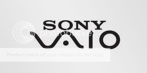
Sony Vaio is a well known brand of laptops. But did you know that the name Vaio logo also had a hidden meaning? Well, the first two letters represent the basic analogue signal. The last two letters look like a 1 and 0, representing the digital signal.
Tostitos chips Logo

If you look at the center of this logo, you can see two people enjoying a Tostito chip with a bowl of salsa. This logo conveys an idea of people connecting with each other.
Formula 1 Logo
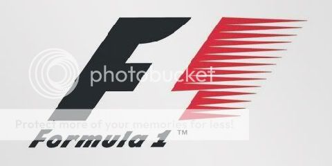
At first, this logo might not make much sense. But if you look closely, you'll see the number 1 in the negative space between the F and the red stripes. I also love how this logo communicates a feeling of speed.
Body Wisdom Logo
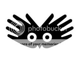 It
is a logo design for a high end day spa… the hands effectively convey
relaxing massage integrated with the proximity of the “owl eyes” to
clearly say “wisdom”.
It
is a logo design for a high end day spa… the hands effectively convey
relaxing massage integrated with the proximity of the “owl eyes” to
clearly say “wisdom”.
Forkwire Logo
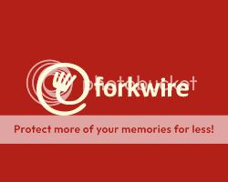
Designer – Bojan Stefanovic. Being an Online Food Delivery service, its logo shows a fork formed into an @ symbol! Such a easy logo to remember.
Big Ten Logo
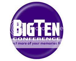
The Big Ten collegiate conference has eleven schools but they didn’t want to change their name. However, they used their logo to hide the numerical “11” in the nam
Amazon Logo
 This
famous logo is extremely clean and simple but this arrow might not look
like more than a smile to you. Before, coming to any conclusions I
would like you to know the concept behind this…it says that amazon.com
has everything from a to z and it also represents the smile brought to
the customer’s face.
This
famous logo is extremely clean and simple but this arrow might not look
like more than a smile to you. Before, coming to any conclusions I
would like you to know the concept behind this…it says that amazon.com
has everything from a to z and it also represents the smile brought to
the customer’s face.
ED Logo: Gianni Bortolotti

The designer of ED Logo – “Elettro Domestici -Home Appliances” in English, changed the concept of traditional logo designing through this logo. The designer has amazingly used the negative space to demonstrate the letter “E” and “D” making the logo look like an electric plug. Designer – Josiah Jost.
Eight Logo
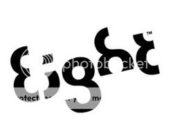 This
logo is too good to be ignored….it is very cleverly designed with a
typeface where every letter is a variation of number 8. Nothing better
have been thought.
This
logo is too good to be ignored….it is very cleverly designed with a
typeface where every letter is a variation of number 8. Nothing better
have been thought.
Elle Hive Logo
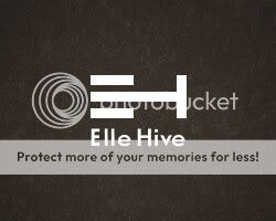
It is a company which designs compact tractors. The letters “E” and “H” make up the image of a tractor. Designer – Toni
Toblerone Logo
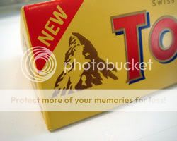
One of my favorite chocolates…yummy!! But trust me I never noticed the brilliant logo while enjoying my bar. You must be thinking what is there to find out as it clearly shows the Swiss Alps? Let me explain…Toblerone originated in Bern, Switzerland – A city whose name is rumored to mean, “City of bears”. When you look at it again you will find a bear in the logo.
Marriage Logo
 What
better logo can be used to symbolize a marriage with two mirrored “R”
in the middle. No frills, no shadows, still so powerful and meaningful.
What
better logo can be used to symbolize a marriage with two mirrored “R”
in the middle. No frills, no shadows, still so powerful and meaningful.
Heart Beats Logo

Although it is quiet evident but still I liked the concept a lot. Two musical notes are bent in a way to make a heart and and headphns. The softness of this logo expresses “Love for Music“
Logo !N3K8

The complexity of this logo is its beauty. It is a business and IT consulting company based in the UK and the logo is a combination of numeric and alphabets to explain the word “intricate”.
FedEx Logo
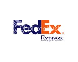 You
would say you have seen it thousand times but just to make you notice
an arrow formed between the letters “E” and “X” conveying speed,
direction and reliability of this amazing courier service.
You
would say you have seen it thousand times but just to make you notice
an arrow formed between the letters “E” and “X” conveying speed,
direction and reliability of this amazing courier service.
Review Logo

Designer – Sean Farrell Logo Design. When you take off a piece of the “v” in the word “review” it forms a check mark (for review). Simply amazing!!
Lafeyette Logo
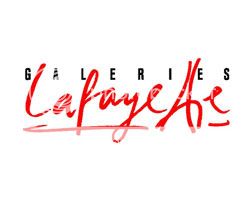 If
you’ve ever visited one of the famous stores in Paris – Galeries
Lafayette, you will notice that it’s logo represents Paris with its
joined letters “t” to form Eiffel Tower. C’est magnificique!
If
you’ve ever visited one of the famous stores in Paris – Galeries
Lafayette, you will notice that it’s logo represents Paris with its
joined letters “t” to form Eiffel Tower. C’est magnificique!
Pakuy Logo
 Designer – Maumer. As “Pakuay” is a packaging company, so the logo shows a broken down box in the shape of the letter “P”
Hartford Whalers Logo

The logo shows 3 concepts at the same time. A whale’s tail, letter “W” in green and the white space forming an “H” for Hartford.
ZIP Logo
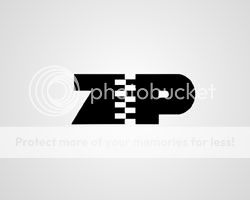
Zip – The “I” has been replaced with a zipper to connect the Z & P. Designer – Mike Erickson
VIA Rail Canada Logo
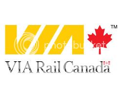 Notice
carefully…the VIA rail Canada logo makes two train tracks with the
letters” V” and the “A”. The alphabet “I” is the division between the
two. A simply brilliant logo.
Notice
carefully…the VIA rail Canada logo makes two train tracks with the
letters” V” and the “A”. The alphabet “I” is the division between the
two. A simply brilliant logo.
Mosleep Logo
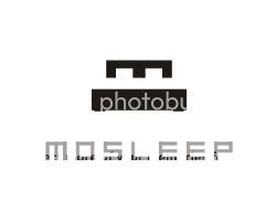 You
will notice here how cleverly designer have integrated a bed with the
letter “M” to come up with a logo for an organization of doctor’s
dealing with sleep issues.
You
will notice here how cleverly designer have integrated a bed with the
letter “M” to come up with a logo for an organization of doctor’s
dealing with sleep issues.
Fuga Logo
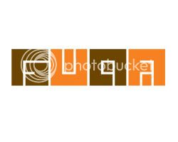 It
is a logo for Architecture Center Of Budapest and looks more like a
maze but if you follow the white space, the four lettered company name
will become evident.
It
is a logo for Architecture Center Of Budapest and looks more like a
maze but if you follow the white space, the four lettered company name
will become evident.
Piano Forest Logo
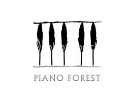 The
designer gives the message in a subtle but evident manner by shaping
piano keys like trees to resemble a keyboard/piano. Designer: Jason Cho.
The
designer gives the message in a subtle but evident manner by shaping
piano keys like trees to resemble a keyboard/piano. Designer: Jason Cho.
NorthWest Old Logo
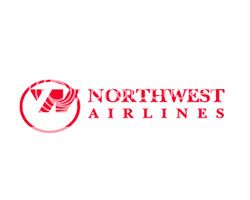 The
logo reflected a clever way of splitting the alphabets, N and W (north
west) along with a location pointed to by the red triangle in the upper
left corner. The redesign lost the charm of the original.
The
logo reflected a clever way of splitting the alphabets, N and W (north
west) along with a location pointed to by the red triangle in the upper
left corner. The redesign lost the charm of the original.
Horror Films Logo
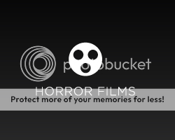
This could be defined as real creativity…A regular film reel turned to look like a scary ghost for a production house. Designer:Josiah Jost
Yoga Australia Logo
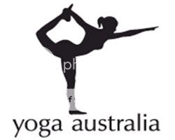
At first glance the logo may look like a simple picture of a young girl doing her yoga exercise but if you watch it carefully the body posture is creating the Australia Map.
LDG Logo:

Well, this logo proves how creative logo designing companies could be with their own logos. Very artistically the designer has merged the upper arcs of the letter “D” and “G” with the initials of the company name to symbolize “The Guru”.
London Museum Logo:
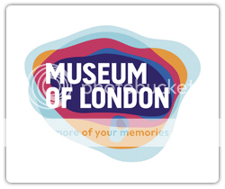
The logo, at first glance, looks like a bunch of colored/transparent shapes on top of each other. But I bring this logo to make you realize that each shape is the shape of what London looked like once. The entire logo represents the evolution of the land of London through time.
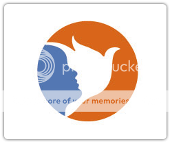
Concealed Logo:

This logo is among one of my favorite logos…brilliant use of negative space makes this logo extraordinary. It has been designed by Ronald J. Cala II for Children’s Book, Editorial. The “Black and White” graphics show the silhouettes of two running children with a dove forming between their clasped hands.
Hope For Children Initiative Logo:

For the first glance the logo shows “Africa’s Map” but with a penetrating look you will see the outlined face of a child and a protective elderly figure. In fact I noticed the faces first and then saw the map…strange?
8 fish Logo:
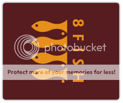
I am sure, at the first glance you can’t figure out the 8 fish instantly or maybe I am being a little dumb ;) The designer, very creatively, uses the negative space and monotones to show 8 fish in one logo.
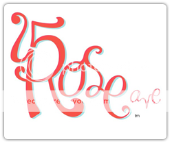
15 Rose Ave Logo:
This logo is used by a chain of hotel/hostel/suites but the way “5” & “R” have worked together makes it exceptional. This merging and beautiful color combination is adding a subtle vintage feel to the logo.
Minimum Logo:

This wavy logo looks like "a queue of letter ‘U’ but I would like you to give a second look. Designed by Kilment Kalchev, the logo spells the word minimum in an unrecognizing manner. I really enjoyed figuring it out
"B" Logo:
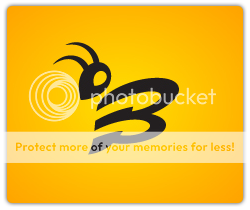
Although you might think it is a simple “Symbolic Logo” showing a “Bee” but what makes it more appealing is the portraying of the letter “B” and the real “Bee” through a simple symbol.
Milwaukee Brewers Logo (MB):

I am sure one cannot miss the letters “m” and “b” in this logo but marking it as a baseball team the logo is a clear picture of a glove clasping the met ball.
The Bison:
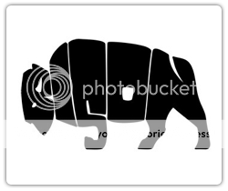
This logo clearly proves how letters of a word can be distorted to create a completely different shape to reinforce its meaning while maintaining readability.
Academy of Fine Arts Logo:

The logo shows merger of the lower case letters "A", "S" and "P". I think the first two letters are quiet easily figured out but "P" being the shortest of the three letters is losing its legibility…what do you think?
Church Logo:
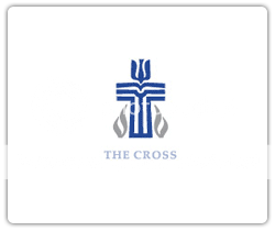
Done by Malcolm Grear and Associates, it’s a true masterpiece of simplifying complexity. It appears a simple Cross shape but hidden inside are a dove, a clerical robe, a pulpit with bible, flames, and a fish. Check out how many of these symbols you can find out.
Carrefour Logo:
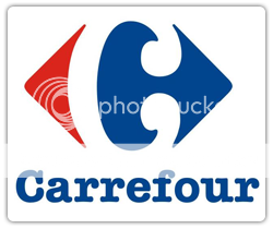
Carrefour in French means “crossroads” and the logo shows two opposite arrows inside a diamond shaping the C letter with the negative space between them but let me confess, I never saw the letter “C” until someone pointed it out to me…
London Symphony Orchestra Logo:

Although the logo looks like a single flowing line creating three initials L.S.O in air. The harmonious graphic of this logo marks the unbreaking rhythm of an Orchestra.
Cattleyard Logo:
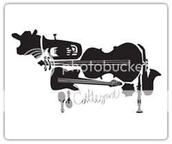
Being music related business; the creator of this logo has used various graphics of musical instruments to form the overall shape of a cow. In my opinion this logo is the best example of combining the graphical elements to express a company’s name.
Candy Logo:
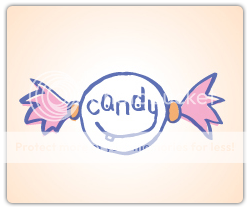
Do you know how many things have been blended in here? A girl’s head, stereotypical image of a candy and the spelling of “Candy” itself is making the logo so appealing.
Philadelphia Flyers logo:
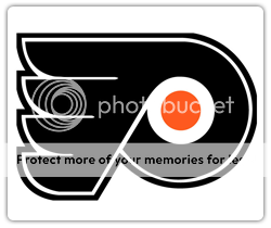
If you analyze this logo carefully you will find a “double treat” of hidden messages. It may appear as a streaked “P” but I see a puck with wings and a hidden hockey stick emerging from the centre circle in the logo. Do you see it now?
Modern Nerd Logo:
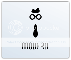
The special features of this logo is it’s way to spell the term “Modern Nerd” and then using the symbolic shapes of hair, glasses and tie to portray the stereotypical geek/nerd image.
Peace Logo:
This logo has been designed by Felix Sockwell showing a child’s figure face integrated with a flight of a dove. I am not aware which company uses this logo but will really appreciate if any of you know more about this logo…so do share.
5.10 Logo:

Five-Ten is a famous family-owned company dedicated to make the best outdoor sports footwear available. When seen in upside position the logo shows a very clever blend of the numeric’s of 5 and10.
Newman Logo:
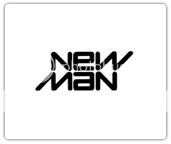
I would add my personal favorite, the reversible Newman logo. This logo is the best example of simple but clever logo…what say?
Mamouth Logo:
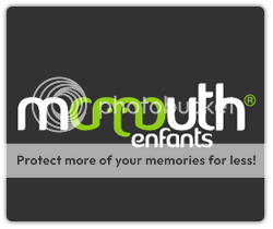
This logo is for a French children clothing store. Although there’s two "m" in French for the word "mammouth" but the designer has played well to make the mammoth face with the single alphabet.
Society 27 Logo:

The good thing about this logo is that it shows the same when viewed in an upside down position. The abstract use of "quotes" and number "7" show the number 27 clearly.
Hammer Logo :
This logo is a creative example of utilising the negative space to make your logo leave a lasting impression. The integration of the letter "H" with the hammer is outstanding and a little difficult to find at first glance.
Baskin Robins Logo:

There is the Baskin Robins new logo, in where the BR also creates the number 31 for how many flavors they have. I found it very clever.
Treacy Shoes Logo:
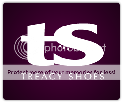
This logo is the cutest example of hidden logos. The hidden shoe packed between the company initials conveys the company message in a very stylish and interesting way.
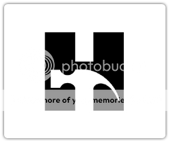
Rehabilitation of Hospital Logo:
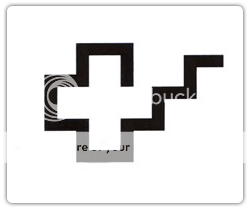
This logo is a simple symbol but a complex and a sacred message. The globally renowned cross symbol represents help and medical attention while the steps reflect on the steps taken back to normal life.
Schizophrenic Logo:
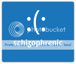
Actually this term is used for a medical disorder that often depicts split personalities. Therefore the logo depicts a happy and sad face both at the same time. I loved the simplicity and multi purpose of this logo.
Nicholson Logo:
Honestly speaking…I don’t know much about this logo but found it amazingly creative to show the letter “N”I will really appreciate if any of you could tell about the company this logo belongs to so I can give the real credit.
To Beat or Not to Beat Logo:

The logoshows a simple "question mark" but if you watch it closely you will notice it is a belt turned into a question mark pointing the old-fashioned parenting methods. The logo asks if we should "beat or not to beat" a child
Sony Vaio is a well known brand of laptops. But did you know that the name Vaio logo also had a hidden meaning? Well, the first two letters represent the basic analogue signal. The last two letters look like a 1 and 0, representing the digital signal.
Tostitos chips Logo
If you look at the center of this logo, you can see two people enjoying a Tostito chip with a bowl of salsa. This logo conveys an idea of people connecting with each other.
Formula 1 Logo
At first, this logo might not make much sense. But if you look closely, you'll see the number 1 in the negative space between the F and the red stripes. I also love how this logo communicates a feeling of speed.
Body Wisdom Logo
Forkwire Logo
Designer – Bojan Stefanovic. Being an Online Food Delivery service, its logo shows a fork formed into an @ symbol! Such a easy logo to remember.
Big Ten Logo
The Big Ten collegiate conference has eleven schools but they didn’t want to change their name. However, they used their logo to hide the numerical “11” in the nam
Amazon Logo
ED Logo: Gianni Bortolotti
The designer of ED Logo – “Elettro Domestici -Home Appliances” in English, changed the concept of traditional logo designing through this logo. The designer has amazingly used the negative space to demonstrate the letter “E” and “D” making the logo look like an electric plug. Designer – Josiah Jost.
Eight Logo
Elle Hive Logo
It is a company which designs compact tractors. The letters “E” and “H” make up the image of a tractor. Designer – Toni
Toblerone Logo
One of my favorite chocolates…yummy!! But trust me I never noticed the brilliant logo while enjoying my bar. You must be thinking what is there to find out as it clearly shows the Swiss Alps? Let me explain…Toblerone originated in Bern, Switzerland – A city whose name is rumored to mean, “City of bears”. When you look at it again you will find a bear in the logo.
Marriage Logo
Heart Beats Logo
Although it is quiet evident but still I liked the concept a lot. Two musical notes are bent in a way to make a heart and and headphns. The softness of this logo expresses “Love for Music“
Logo !N3K8
The complexity of this logo is its beauty. It is a business and IT consulting company based in the UK and the logo is a combination of numeric and alphabets to explain the word “intricate”.
FedEx Logo
Review Logo
Designer – Sean Farrell Logo Design. When you take off a piece of the “v” in the word “review” it forms a check mark (for review). Simply amazing!!
Lafeyette Logo
Pakuy Logo
Hartford Whalers Logo
The logo shows 3 concepts at the same time. A whale’s tail, letter “W” in green and the white space forming an “H” for Hartford.
ZIP Logo
Zip – The “I” has been replaced with a zipper to connect the Z & P. Designer – Mike Erickson
VIA Rail Canada Logo
Mosleep Logo
Fuga Logo
Piano Forest Logo
NorthWest Old Logo
Horror Films Logo
This could be defined as real creativity…A regular film reel turned to look like a scary ghost for a production house. Designer:Josiah Jost
Yoga Australia Logo
At first glance the logo may look like a simple picture of a young girl doing her yoga exercise but if you watch it carefully the body posture is creating the Australia Map.
LDG Logo:
Well, this logo proves how creative logo designing companies could be with their own logos. Very artistically the designer has merged the upper arcs of the letter “D” and “G” with the initials of the company name to symbolize “The Guru”.
London Museum Logo:
The logo, at first glance, looks like a bunch of colored/transparent shapes on top of each other. But I bring this logo to make you realize that each shape is the shape of what London looked like once. The entire logo represents the evolution of the land of London through time.
Concealed Logo:
This logo is among one of my favorite logos…brilliant use of negative space makes this logo extraordinary. It has been designed by Ronald J. Cala II for Children’s Book, Editorial. The “Black and White” graphics show the silhouettes of two running children with a dove forming between their clasped hands.
Hope For Children Initiative Logo:
For the first glance the logo shows “Africa’s Map” but with a penetrating look you will see the outlined face of a child and a protective elderly figure. In fact I noticed the faces first and then saw the map…strange?
8 fish Logo:
I am sure, at the first glance you can’t figure out the 8 fish instantly or maybe I am being a little dumb ;) The designer, very creatively, uses the negative space and monotones to show 8 fish in one logo.
15 Rose Ave Logo:
This logo is used by a chain of hotel/hostel/suites but the way “5” & “R” have worked together makes it exceptional. This merging and beautiful color combination is adding a subtle vintage feel to the logo.
Minimum Logo:
This wavy logo looks like "a queue of letter ‘U’ but I would like you to give a second look. Designed by Kilment Kalchev, the logo spells the word minimum in an unrecognizing manner. I really enjoyed figuring it out
"B" Logo:
Although you might think it is a simple “Symbolic Logo” showing a “Bee” but what makes it more appealing is the portraying of the letter “B” and the real “Bee” through a simple symbol.
Milwaukee Brewers Logo (MB):
I am sure one cannot miss the letters “m” and “b” in this logo but marking it as a baseball team the logo is a clear picture of a glove clasping the met ball.
The Bison:
This logo clearly proves how letters of a word can be distorted to create a completely different shape to reinforce its meaning while maintaining readability.
Academy of Fine Arts Logo:
The logo shows merger of the lower case letters "A", "S" and "P". I think the first two letters are quiet easily figured out but "P" being the shortest of the three letters is losing its legibility…what do you think?
Church Logo:
Done by Malcolm Grear and Associates, it’s a true masterpiece of simplifying complexity. It appears a simple Cross shape but hidden inside are a dove, a clerical robe, a pulpit with bible, flames, and a fish. Check out how many of these symbols you can find out.
Carrefour Logo:
Carrefour in French means “crossroads” and the logo shows two opposite arrows inside a diamond shaping the C letter with the negative space between them but let me confess, I never saw the letter “C” until someone pointed it out to me…
London Symphony Orchestra Logo:
Although the logo looks like a single flowing line creating three initials L.S.O in air. The harmonious graphic of this logo marks the unbreaking rhythm of an Orchestra.
Cattleyard Logo:
Being music related business; the creator of this logo has used various graphics of musical instruments to form the overall shape of a cow. In my opinion this logo is the best example of combining the graphical elements to express a company’s name.
Candy Logo:
Do you know how many things have been blended in here? A girl’s head, stereotypical image of a candy and the spelling of “Candy” itself is making the logo so appealing.
Philadelphia Flyers logo:
If you analyze this logo carefully you will find a “double treat” of hidden messages. It may appear as a streaked “P” but I see a puck with wings and a hidden hockey stick emerging from the centre circle in the logo. Do you see it now?
Modern Nerd Logo:
The special features of this logo is it’s way to spell the term “Modern Nerd” and then using the symbolic shapes of hair, glasses and tie to portray the stereotypical geek/nerd image.
Peace Logo:
This logo has been designed by Felix Sockwell showing a child’s figure face integrated with a flight of a dove. I am not aware which company uses this logo but will really appreciate if any of you know more about this logo…so do share.
5.10 Logo:
Five-Ten is a famous family-owned company dedicated to make the best outdoor sports footwear available. When seen in upside position the logo shows a very clever blend of the numeric’s of 5 and10.
Newman Logo:
I would add my personal favorite, the reversible Newman logo. This logo is the best example of simple but clever logo…what say?
Mamouth Logo:
This logo is for a French children clothing store. Although there’s two "m" in French for the word "mammouth" but the designer has played well to make the mammoth face with the single alphabet.
Society 27 Logo:
The good thing about this logo is that it shows the same when viewed in an upside down position. The abstract use of "quotes" and number "7" show the number 27 clearly.
Hammer Logo :
This logo is a creative example of utilising the negative space to make your logo leave a lasting impression. The integration of the letter "H" with the hammer is outstanding and a little difficult to find at first glance.
Baskin Robins Logo:
There is the Baskin Robins new logo, in where the BR also creates the number 31 for how many flavors they have. I found it very clever.
Treacy Shoes Logo:
This logo is the cutest example of hidden logos. The hidden shoe packed between the company initials conveys the company message in a very stylish and interesting way.
Rehabilitation of Hospital Logo:
This logo is a simple symbol but a complex and a sacred message. The globally renowned cross symbol represents help and medical attention while the steps reflect on the steps taken back to normal life.
Schizophrenic Logo:
Actually this term is used for a medical disorder that often depicts split personalities. Therefore the logo depicts a happy and sad face both at the same time. I loved the simplicity and multi purpose of this logo.
Nicholson Logo:
Honestly speaking…I don’t know much about this logo but found it amazingly creative to show the letter “N”I will really appreciate if any of you could tell about the company this logo belongs to so I can give the real credit.
To Beat or Not to Beat Logo:
The logoshows a simple "question mark" but if you watch it closely you will notice it is a belt turned into a question mark pointing the old-fashioned parenting methods. The logo asks if we should "beat or not to beat" a child
Subscribe to:
Comments (Atom)